The rise of tools like Canva has made graphic design more accessible than ever. With just a few clicks, businesses and individuals can create marketing materials. What’s hard is making these materials look polished and professional. Good graphic design principles are the secret sauce to make your marketing shine!
Great design is more than just aesthetics; it’s about communicating a message effectively and maintaining brand consistency. Whether you’re a DIY designer or part of a marketing team, understanding key design principles will help you create visuals that have just enough structure to play with the creative side of things.
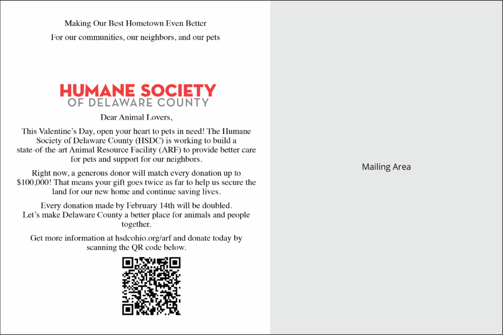
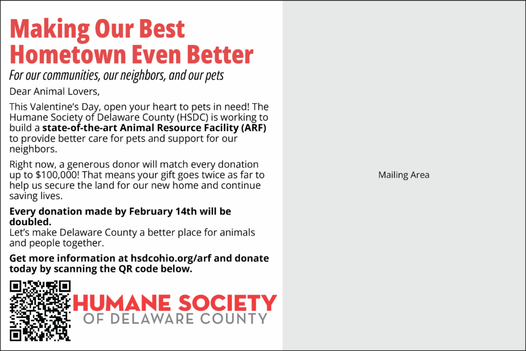
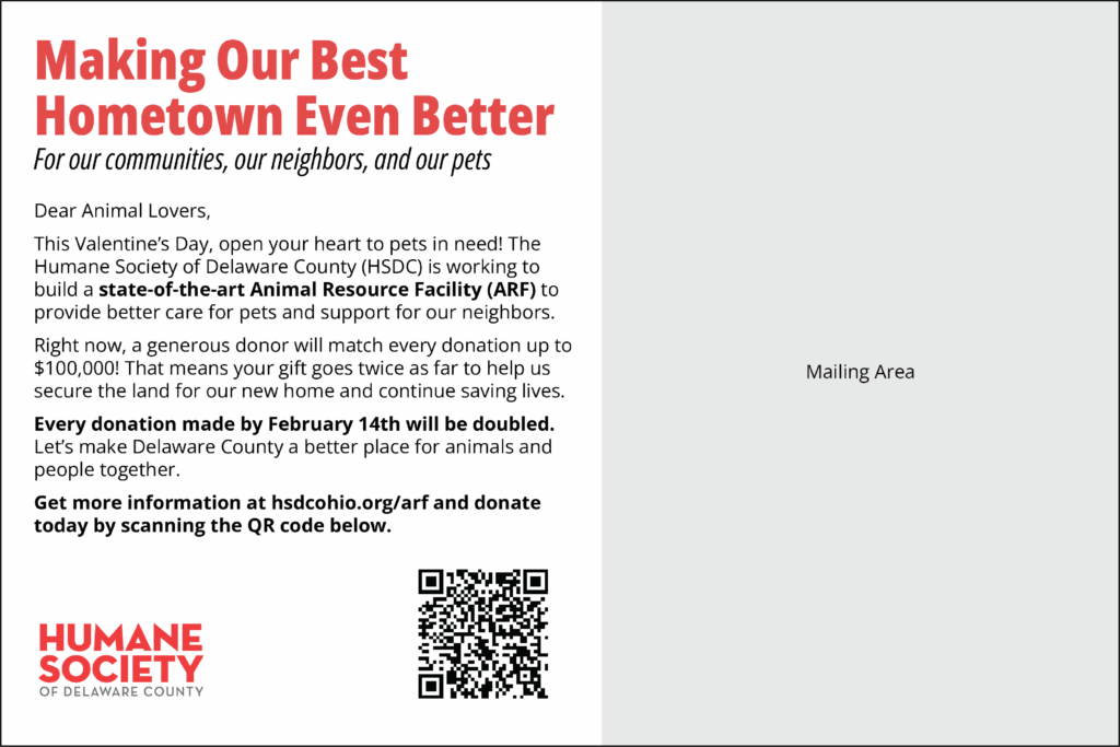
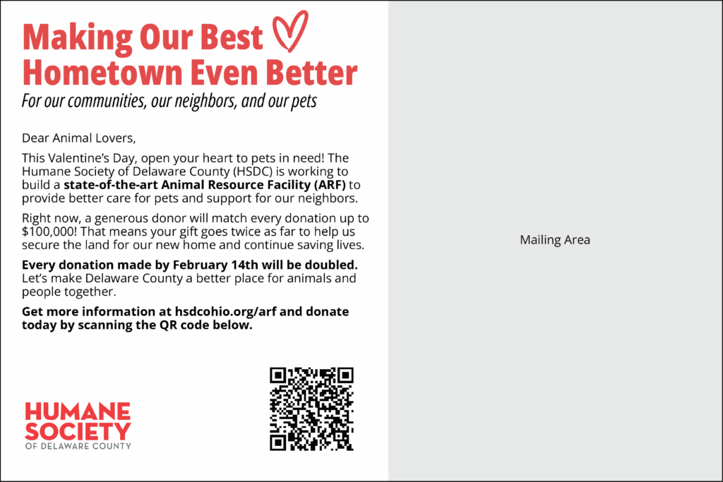
In this guide, we’ll explore essential design principles including visual organization, contrast, white space, and brand identity to take your marketing materials to the next level. In each section, we’ll refine a postcard step by step, transforming basic content into a polished final version to demonstrate these principles in action. Let’s start with the information below:

The Importance of Design Principles in Branding
In an oversaturated digital world, well-designed marketing materials help brands and companies stand out. Strong design enhances credibility, builds trust, and improves audience engagement. However, many businesses fall into the trap of prioritizing “visual appeal” over consistent brand recognition.
When used correctly, design principles ensure that:
- Your brand remains recognizable and cohesive.
- Your message is clear and easy to understand.
- Your visuals capture attention and guide the viewer’s eye effectively.
Learning how to respect these fundamental principles allows you to create marketing materials supporting your brand’s intention while creating the space to play with fun elements.
1. Visual Organization: Structuring Your Designs for Impact
One of the most critical aspects of design is visual hierarchy—the way elements are arranged to direct the viewer’s focus. Without proper organization, marketing materials can feel cluttered, making it difficult for your audience to engage with your message. We want the viewer’s eye to naturally (and purposefully) flow through the image.
Common Mistakes:
- Overloading designs with too much information.
- Misaligned text and images creating visual chaos.
- Lack of clear structure, making it difficult for viewers to process information.
How to Improve Visual Organization:
- Use grids and alignment: Aligning elements properly creates a sense of balance and order.
- Establish hierarchy with size and weight: Headlines should stand out, while supporting text should be secondary.
- Limit the number of focal points: Too many competing elements can confuse the viewer.


2. Color and Typography: Creating a Consistent Visual Identity
Color and typography are essential elements of any brand’s design system. When used consistently, they enhance recognition and create a strong, unified look across all marketing materials.
Common Mistakes:
- Using too many different fonts, leading to a chaotic look.
- Not considering accessibility—low-contrast text can be hard to read.
- Inconsistent application of brand colors, reducing recognition.
How to Use Color Effectively:
- Stick to a defined palette: Choose a set of brand colors and use them consistently across all designs.
- Ensure readability: Text should always contrast well against the background. This is vital for accessibility!
- Use color for emphasis: Highlight key elements, such as calls to action, with a bold color within your brand palette.
How to Use Typography Effectively:
- Limit your font choices: Use no more than 2-3 fonts to maintain cohesion.
- Establish a hierarchy: Headlines should be bold and attention-grabbing, while body text should be clear and readable.
- Be mindful of spacing: Proper line height and letter spacing improves readability and visual balance.

3. White Space: Being Bold by Doing Less
Many people feel the need to fill every available space with content, but white space (also called negative space) is a crucial design tool. It helps break up content, making designs feel more open and digestible. It’s important to let your design breathe!
Common Mistakes:
- Overcrowding text and images.
- Not leaving enough margin around important elements.
- Thinking of white space as wasted space instead of a design feature.
How to Use White Space Effectively:
- Give text and images room to breathe: To improve readability, reduce overwhelming clutter that is distracting to the viewer.
- Don’t try to put all your content onto the image: People know to look in captions and links for more information. The image should draw them in, not reveal everything. This also helps with conversion! Get them to your website or profile to see the rest of what you do.
- Focus attention: Don’t be afraid to leave areas empty. Intentional white space enhances clarity.

4. Brand Identity: Maintaining Consistency While Staying Creative
Brand identity isn’t just about having a good logo; it’s about creating a recognizable look and feel across all your marketing materials. Consistency builds trust and helps audiences instantly associate content with your brand. It’s important to identify which elements (color, scale, imagery, pattern) stay the same every time, and which elements you want to have fun with.
Common Mistakes:
- Inconsistent use of colors, fonts, and logo placement.
- Random visual styles that make the brand feel disjointed.
- Copying trends without maintaining brand identity.
How to Balance Consistency and Creativity with Brand Identity:
- Respect your core brand elements: Keep your logo use, color palette, and fonts the same, but experiment with layout and content formats.
- Play with Scale: Elements of your logo, imagery of your company at work, and text, can all be blown up to explore details of your brand. This can also build your brand when seen as a series of elements (curves, shapes, colors).
- Be edgy: Don’t be afraid to pull things off the page (full bleed), make it semi unreadable, and layer! If your brand is strong, it will support playing with a few elements.

Mastering these basic design principles isn’t about stifling creativity for you or your brand. Rather, it’s about providing a strong foundation for it to flourish! By understanding how to effectively use color, typography, visual organization, white space, and your brand identity, you can confidently create marketing materials that not only look professional but also powerfully communicate your message and build lasting brand recognition. So go ahead and experiment within these guidelines, have fun testing the boundaries, and watch your brand marketing shine!
Want help creating and perfecting your designs? We’re always here to help your with your marketing needs.