Accessibility in marketing and communication isn’t just a best practice; it’s a necessity. Approximately 16% of the world’s population lives with some form of disability and 54% of American adults read[KP1] below a 6th grade reading level.
When your content is easy to see, read, hear, and navigate, you’re not only meeting legal standards, you’re ensuring that everyone in your audience can engage with your message. Whether you’re creating a flyer, social media graphic, digital ad, or presentation, designing with accessibility in mind helps break down barriers and demonstrates a commitment to inclusion.
Making your content more accessible isn’t as daunting as you might think. A few months ago, we shared this blog with basic design principles to follow when designing your content. Building on that advice, we’re sharing additional accessibility-focused tips to help ensure your digital content reaches and resonates with everyone.
Font Choice
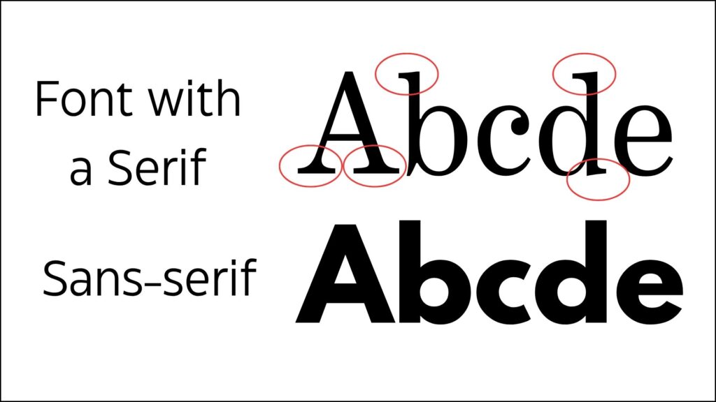
As a brand, you should have 2-3 fonts that you use to maintain cohesion in your designs. In addition, both the Americans with Disabilities Act (ADA) and Architectural Barriers Act (ABA) state that fonts should be “sans-serif,” which is the small stroke on certain letters, because they have higher readability. Some great sans-serif fonts that are commonly available are Arial, OpenSans and Montserrat.

Color Contrast
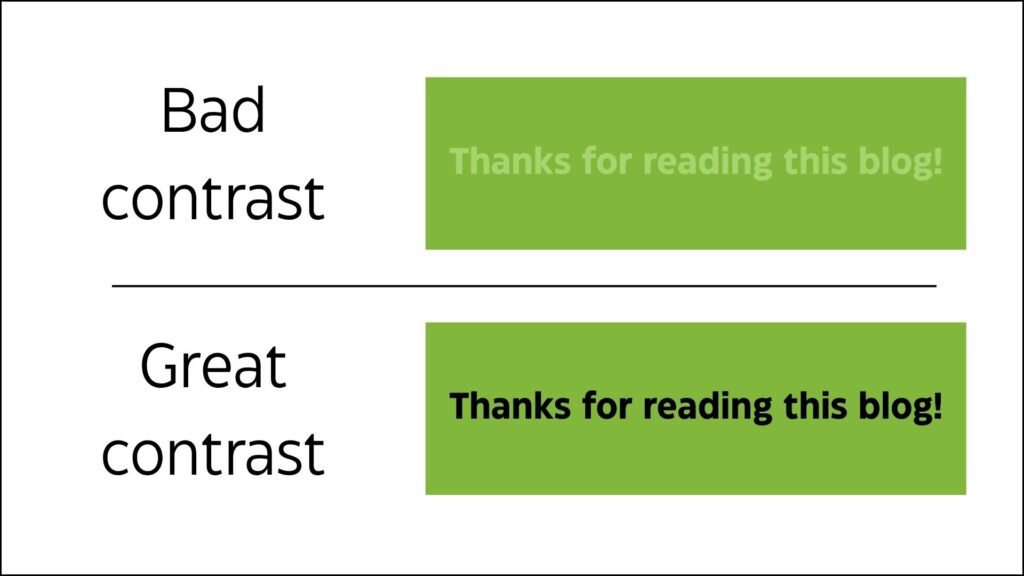
Some color combinations can make things difficult to read, especially for those with visual impairments or color blindness. It’s important to choose high-contrast colors so your audience can see and read your content.

Alternative Text
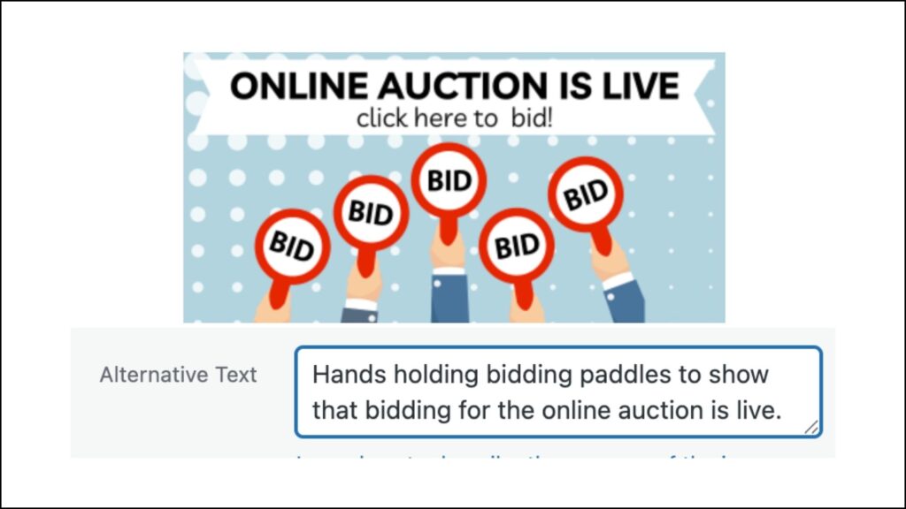
Images that will be used on a digital platform (e.g. website, email marketing system, social media, digital documents) should have alternative text, also known as alt text or alt descriptions. This text enables screen readers and assistive technology to read to the user the information that is conveyed in the image. If you’re creating an image that is purely decorative, it doesn’t need alt text.

When writing alt text:
- Describe the image meaning or function, don’t just list the image details.
- Keep it short. There’s no need to include words like “image of…” or “photo of…”
- Don’t repeat information that’s already provided in text that is accompanying the image.
- Don’t use emojis. Just don’t.
How to enter alt text:
- Websites: Your website platform, like WordPress, will allow you to enter alt text after you upload your image. You may need to contact web support if you’re not able to locate this function.
- Email Marketing: In email marketing systems like MailChimp or Constant Contact, you can also add alt text after uploading your image. This may be labeled “image description.”
- Documents: If you’re creating a document that will be shared digitally, you can add alt text directly to an image in platforms like Microsoft Word and Power Point. If you’re using Adobe Acrobat Pro, you can also add them to a PDF. If you download a PDF from Canva, it is automatically accessible.
- Social Media: You can add alt text when uploading an image on social media platforms like Facebook, Instagram, and LinkedIn. If you don’t add it, these platforms will automatically generate an image description for screen readers. If you use a social media scheduling tool like Hootsuite, they also provide a way to add alt text to your post.
There are a few added bonuses in adding alt text! It helps with your search engine optimization (SEO) because search engines review alt text. It will also help users who have firewalls or spam filters that stop images from loading on websites or in emails.
Free resources
So, how can you accomplish all of this when this isn’t even your full-time job? There are a number of great, free resources to help!
Canva Accessibility Checker
A large number of organizations and brands are using Canva to design images and videos for social media, emails, websites, and more. Canva has an accessibility checker that will alert you of issues with the typography (font), color contrast, and alternative text. It will even make suggestions on how to fix the issue! The alt text will be embedded in the image or design file when you export.
Colorblindly Chrome Plug-in
This is an incredible Google Chrome plug-in called Colorblindly that allows you to see how your image would look for people with eight different types of color blindness. This particular plug-in is only available with Chrome.
Accessible Website Scan
There is another Google Chrome plug-in that will help you meet Web Content Accessibility Guidelines (WCAG), a set of international guidelines aimed at making web content more accessible for people with disabilities.
The plug-in will scan your web page and provide the results and even highlight the trouble areas. If you don’t use Google Chrome, you can also use this site from Accessible Web, enter in the page URL, and it will provide a similar report and even lets you know if you are at risk of not being Americans with Disabilities Act (ADA) compliant.
The WCAG plug-in also has a Color Contrast Checker that lets you know if your colors have enough contrast. If you don’t use Google Chrome, you can also go to the WCAG Color Contrast Checker website and enter your color numbers.
Accessibility is Good Design
As amazing as those tools are at alerting you to issues, they won’t catch everything. By following these practical tips and using those free tools, you’re making your content more inclusive and effective.
Accessibility doesn’t require a complete design overhaul — just a shift in mindset and a few intentional choices. When we design for everyone, we create stronger connections, clearer communication, and a more inclusive brand experience. Your audience — all of them — will thank you.


